
overview.
House of Chords was evaluating two redesigned versions of its e-commerce website. I conducted a comparative usability study to determine which experience better supported product discovery and checkout while meeting users’ expectations for clarity, satisfaction, and visual appeal.


business & research challenge.
The central challenge was deciding which website direction could best support both customer needs and business growth. The evaluation examined whether either version improved task efficiency, task success, user satisfaction, and perceived usability across the purchasing journey.
research process.

key findings.
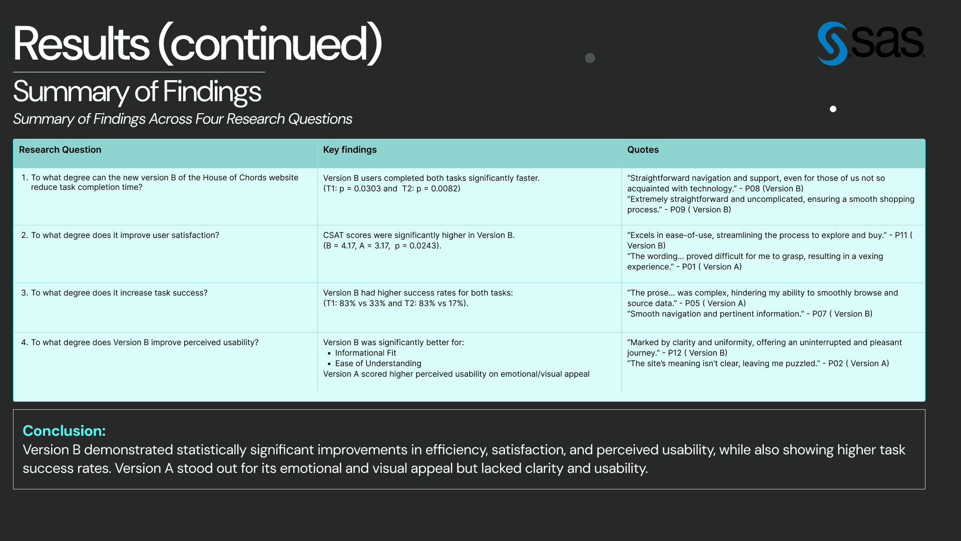
Version B enabled significantly faster task completion and achieved higher user-satisfaction scores. Participants considered it clearer, easier to navigate, and better aligned with their expectations. Although Version B also produced higher task-success rates, the difference was not statistically significant. Version A performed better in visual appeal, creativity, and emotional engagement.


recommendations.
I recommended combining Version B’s clarity and efficiency with Version A’s stronger visual identity.
Additional recommendations are as follows: simplifying complex wording, improving Version A’s checkout flow, strengthening visual consistency in Version B, adding clearer interaction feedback, and providing better instructional guidance throughout both experiences.